Artist Michael Pipher Explores Wright’s Architectural Vision with Ink-and-Paper Renderings
Interview with Brian R. Hannan
These days, one of the toughest tickets in town is for a tour of a Frank Lloyd Wright-designed property. While a few sites have opened in the midst of the current pandemic, other sites will remain indefinitely closed.
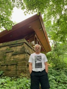
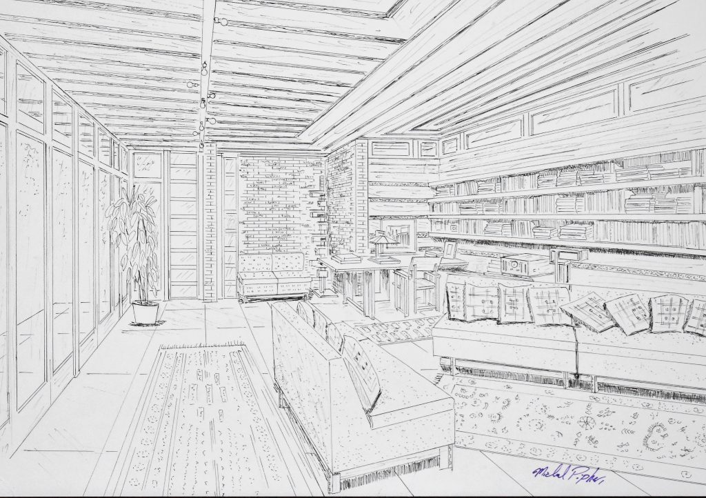
So we sat down with Michael Pipher, a New Jersey artist, for a chat about the more than 5,300 ink-and-paper renderings he’s made of Wright’s work over the course of nearly four decades — the buildings we know and love, lost along the way or never built. He agreed to offer a virtual tour via several of his rarely seen interior drawings.
Pipher said he began drawing “from a young age, mostly freehand stuff like cartoons. I had a love of Disney and the buildings there. I was intrigued by them.
“Having a mom in real estate, I was exposed to homes I knew — the ones I liked, I would start drawing those for fun…. Wright entered my life a short time after that with images of Fallingwater, SC Johnson, Annunciation Greek Orthodox Church, Robie House and the Marin County Civic Center. They filled my head in wondrous delight,” Pipher said.
“I would read anything I could get my hands on that had to do with Wright. The more I read, the more I wanted to know. His designs fueled my soul. I went from drawing Mickey to drawing Fallingwater with the same delight.”
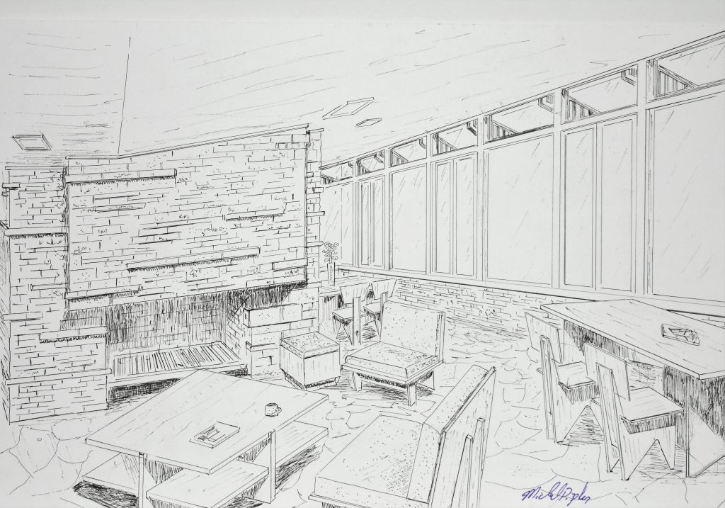
Much is written about Wright’s connectivity between internal and external space. What do you think Wright understood about interior space — for its own sake — that enhances its beauty and utility?
The sense of space in any Wright structure is so much a part of the whole design. This has been the case since the early days to the last projects he designed. The spaces developed over his career, but the main concept remained. The Prairie homes had a space within a space — the inglenook in the living room that was transferred to Usonian homes as alcoves within one main space or great room. In the case of the Pope-Leighey House, the dining space is a part of the whole, but Wright lowers the ceiling to make it more intimate.
We are not meant to stand in a Wright home; we are meant to sit and interact in the space. One of the things most people don’t really get to appreciate is the spaces as they were intended to be used. While you can take a tour of a Wright public site, you mostly cannot sit down or touch anything, so you’re truly not getting the full experience he intended.
Wright would frame the landscape with the placement of windows; he lowered ceilings to force the eye outward to nature. Here we get into a area that transcends what architecture is and what it truly can be. I think when you hear stewards of a Wright-designed home talk about their house, you hear them say how the home changed their lives for the better. You have just another part of the genius that was Wright. I believe he wanted not only the owners but also their guests to sit and think of their place in nature.
I know it is very philosophical to think that a building can truly touch something deep inside us; provoking thought is very far removed in residential architecture today. You look at new housing developments today, and you see that what Wright called “the paper box boys” are still doing things the way they did back in Wright’s time and not reaching for something better or learning from what he gave us.
While today’s buyers want an open floorplan, in a way, what they are getting is an empty shell, hollow of emotion. Wright used and laid the spaces or rooms out in a very playful way. The Prairie homes use of banded trim that lead your eye from space to space, and the homes feel like they are never-ending.
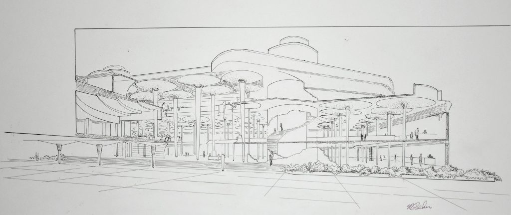
Wright wanted us to discover, to explore and to interact with his treasures.
The new generation may have an open plan but do these people have something to touch their heart or soul? Not in my opinion. Not all the paint and fancy pillows in the world can do that.
I find so many new homes are designed not for a family but what’s going to bring the builder the most return on investment. New homes are big for the sake of being big, on small lots to maximize the number of homes.
The thought of a family coming together in one space is lost. Parents are in different areas of the home, and the kids are off doing their own thing in their rooms. Wright gave the family unit a space that was beautiful to come together that made everyone want to be in that space.
Look at the SC Johnson Administration Building. Employees wanted to come to work just to be in that Great Workroom.
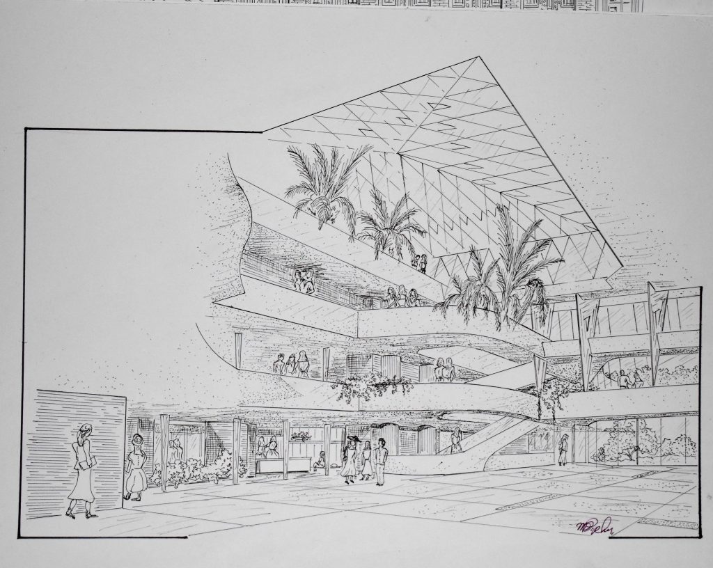
What do you think we find so compelling about Wright’s architecture today?
I believe that for those who want something more than an off-the-shelf plan, with the same old elevation, Wright and organic architecture hold the answers for that special home. With more and more public sites open for curious minds to see firsthand what we in the Wright world already know, some people will visit and just see a nice old home. For those lucky few who can see the open floorplan the way it was meant to be lived in and used, they’ll recognize that the function of the build is in direct relation of the form of the building.
Many people come to visit because of the man and not the architect. I think they are missing out on something special. Wright said architecture was the mother of all arts, and he was a master of using all the arts to the fullest and creating something more beautiful than just a vase on a shelf.
Wright pushed the envelope with design and with construction materials. One can look at the Monona Terrace Community and Convention Center — even though it was built 23 years ago, it looks like it was built yesterday. Now take into account that the first design Wright proposed was in 1938 — and it was more futuristic than what was built 82 years later. It still is. Hollywood can put a Wright design from 1923 in a movie set in the future, and it doesn’t look out of place. I find that compelling.
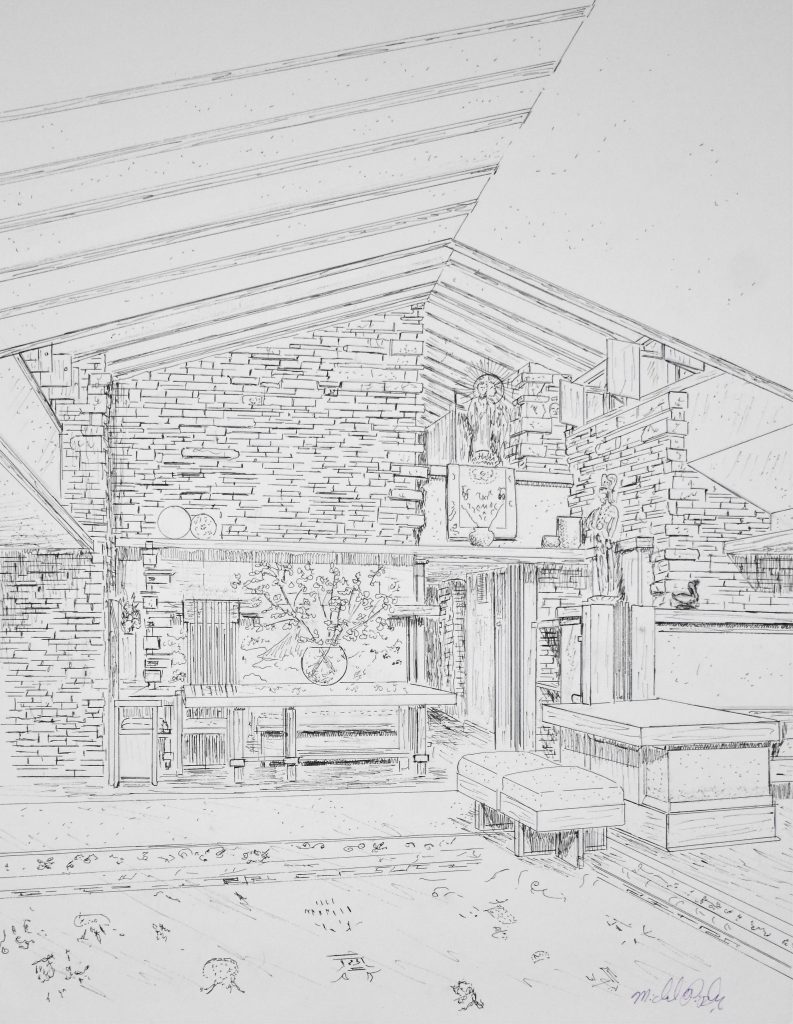
What does re-creating Wright’s work do for your appreciation and understanding of a given property?
Every drawing I do is still a learning exercise, even after 38 years. As a designer, I do stop and look at unbuilt project and will think, “Well, if you did this or that it could be an improvement.” But then I stop and say, “Don’t be silly.”
But, seriously, with new construction materials and improvements, there are things that could be revisited or expanded on — but only with the deepest understanding of the principles that Wright taught us.
Wright was known for trying new things or taking a plan he designed years before and tweaking it and reintroducing it. One has to evolve to try new things but still be respectful of the land and the owners for which it is designed. Wright said: “A great architect is not made by way of a brain nearly as much as he is made by the way of a cultivated enriched heart.”
